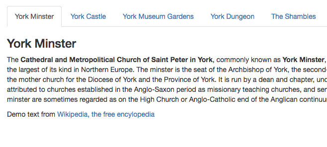
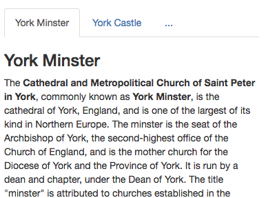
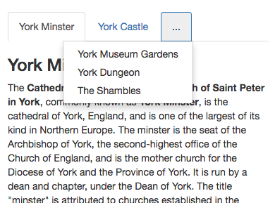
Bootstrap Responsive Tabs is a jQuery plugin which enables Bootstrap tab menus to work well in responsive layouts. When horizontal space is limited, the tab menu will display as many menu items as it can in tabs, and then collapse the remaining menu items into a drop down menu at the end of the tab list.
In order to use the plugin simply include jquery.responsivetabs.js in your code, and attach responsiveTabs() to your tab menu:
<ul class="nav nav-tabs" role="tablist">
	<li role="presentation" class="active"><a href="#yorkminster" aria-controls="home" role="tab" data-toggle="tab">York Minster</a></li>
	<li role="presentation"><a href="#yorkcastle" aria-controls="profile" role="tab" data-toggle="tab">York Castle</a></li>
	<li role="presentation"><a href="#yorkmuseumgardens" aria-controls="profile" role="tab" data-toggle="tab">York Museum Gardens</a></li>
	<li role="presentation"><a href="#yorkdungeon" aria-controls="profile" role="tab" data-toggle="tab">York Dungeon</a></li>
	<li role="presentation"><a href="#theshambles" aria-controls="profile" role="tab" data-toggle="tab">The Shambles</a></li>
</ul>
<script src="https://cdn.rawgit.com/InventPartners/bootstrap-responsive-tabs/master/jquery.responsivetabs.js"></script>
<script>
$(function() {
	$('.nav-tabs').responsiveTabs();
});
</script>
npm install responsive-bootstrap-tabs
Tested with Bootstrap 3.3.7 and jQuery 2.2.4
© 2024 Invent Partners Ltd | Supporters of FdA Web Design, Wakefield